dashboard design
conceptual dashboard design
summary
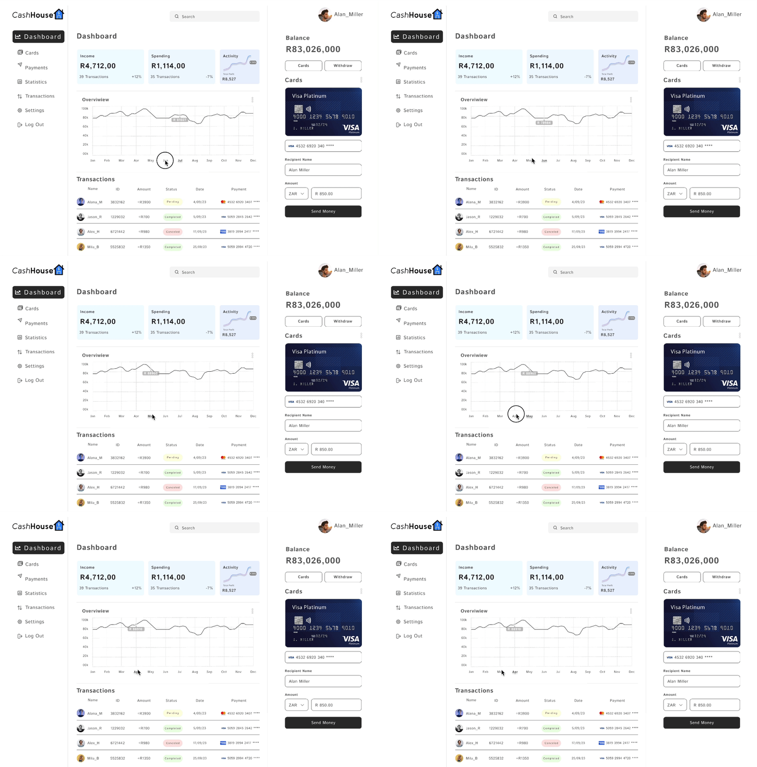
The “CashHouse” dashboard design project simplifies and enhances the financial user experience by addressing the challenges of cluttered aesthetics and a lack of visual account overviews in existing smart wallet dashboards. It embraces a clean and user-friendly design, featuring visually presented monthly overviews for easy comparison of year-long account balances. This approach benefits a diverse user base, including budget-conscious individuals, investors, savers, and financial professionals, by providing improved financial clarity, facilitating informed decision-making, saving time and resources, and catering to both individual and professional financial management needs.
Introduction:
This case study explores the creation of the CashHouse dashboard, a financial tool designed to simplify and enhance users’ understanding of their accounts and financial performance. The project originated from a desire to improve upon existing smart wallet dashboards, which often lacked aesthetic clarity and comprehensive account overviews.
Problems and Challenges:
Challenges Addressed:
1. Aesthetic Clutter: Many existing smart wallet dashboards suffered from visual clutter, making it difficult for users to quickly grasp their financial information and transaction history.
2. Lack of Visual Account Overviews: Users were often presented with extensive data but lacked an easily digestible visual representation of their financial health over time.
Solutions Implemented:
1. Aesthetic Simplicity: The CashHouse dashboard embraced a clean and uncluttered design, with a focus on simplicity and user-friendly aesthetics. This approach reduced visual noise and allowed users to navigate their financial data with ease.
2. Visual Account Overviews: The dashboard featured visually presented monthly overviews, allowing users to compare their account balances and financial trends over the course of a year. This visual representation provided valuable insights at a glance.

the cashhiouse dashbaord
User Profiles Benefiting from the Redesign:
1.
Budget-Conscious User:
-
- An individual or family keen on tracking and managing their expenses.
- Benefits from the dashboard’s simplicity and intuitive categorization of transactions, helping them make informed financial decisions.
-
Investor and Saver:
- A user with investments or savings goals.
- Appreciates the clear account overviews, which help them assess the performance of their investments and savings over time.
-
Financial Planner:
- A financial professional or consultant responsible for managing multiple clients’ finances.
- Utilizes the dashboard’s concise and visually appealing summaries to communicate financial progress and recommendations to clients.
Benefits of the CashHouse Dashboard:
-
Improved Financial Clarity: The design’s aesthetic simplicity and visual account overviews empower users to grasp their financial status quickly and accurately.
-
Enhanced Decision-Making: Users can make informed decisions with the help of clear financial data, simplifying budgeting, investing, and savings strategies.
-
Time and Resource Efficiency: The dashboard’s user-friendly design streamlines financial management, reducing the time and effort required to navigate and comprehend financial information.
-
Professional Application: The dashboard is suitable for both individual and professional use, including financial planners who can leverage its clarity to assist clients effectively.
Conclusion:
he CashHouse dashboard design project demonstrates the power of simplicity and aesthetics in enhancing the financial user experience. By addressing the challenges of cluttered interfaces and lack of visual account overviews, the dashboard offers users an effective tool for managing their finances and making informed financial decisions.


