e-commerce redesign
amazon redesign case study
summary
In this project, I undertook the redesign of Amazon.com, addressing usability issues by implementing a cleaner layout, an intuitive navigation bar with interactive hover transformations, and increased brand visibility. The modern aesthetics and responsive design enhance the user experience, benefiting frequent shoppers, first-time visitors, and mobile users. This case study showcases my user-centered design approach and the positive impact of my design solutions on a diverse range of users, reaffirming my expertise in UX/UI design and problem-solving.
Introduction:
In this case study, I will explore the process of redesigning Amazon.com to enhance user experience and align the platform with modern design standards. My approach involves addressing several key issues, implementing solutions, and justifying these changes based on the impact they have on three distinct user profiles.

Amazon’s current website
Problems and Challenges:
Problem 1: Complex and Overwhelming Layout
Amazon’s original layout often appeared cluttered and overwhelming to users, making it challenging to navigate, find products, and complete tasks efficiently.
Solution:
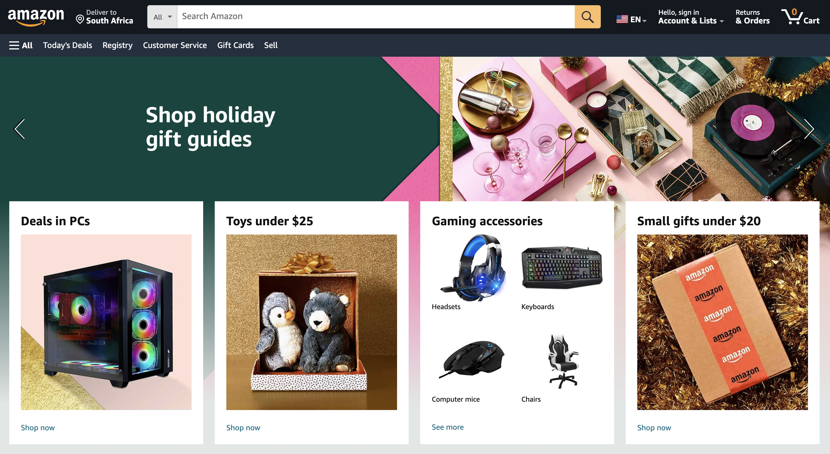
I adopted a cleaner and simpler layout with more white space, providing users with a visually soothing and less overwhelming experience. This streamlined design focuses on essential elements and tasks, making it easier for users to find what they need.
Problem 2: Navigation and Usability
The navigation bar on Amazon.com required improvement. Its functionality wasn’t fully optimized, leading to difficulties in finding categories and sections.
Solution:
I redesigned the navigation bar to be more user-centric, offering quicker access to categories and a more intuitive search experience. Interactive hover transformations make navigation more engaging and efficient.
Problem 3: Brand Visibility
Amazon’s logo was not as prominent as it could be, potentially affecting brand recognition and trust.
Solution:
I made the Amazon logo more obvious and strategically placed, enhancing the platform’s brand identity and reinforcing trust.
Problem 4: Outdated Aesthetics
The previous design had an outdated appearance, falling short of modern, premium design expectations.
Solution:
I modernized the aesthetics through a refreshed color palette and design elements, providing a premium look and feel that aligns with current design trends.

Amazon’s redesigned landing page
User Profiles Benefiting from the Redesign:
Each of these design solutions is rooted in enhancing the user experience, ensuring better usability, and contributing to Amazon’s continued success as an e-commerce giant.
User Profile 1: Frequent Shopper
For a frequent shopper, the cleaner layout offers a more pleasant browsing experience, reducing visual fatigue. The improved navigation bar facilitates quicker access to frequently visited product categories, saving time and effort.
User Profile 2: First-time Visitor
First-time visitors benefit from the simplified layout, which presents a more welcoming introduction to Amazon’s offerings. The intuitive navigation bar helps them quickly explore categories of interest.
The redesign of Amazon.com not only improves the overall aesthetics but also contributes to better functionality and usability for a diverse user base.
Amazon’s redesign
Conclusion:
This case study illustrates the process of redesigning a complex e-commerce website like Amazon.com, emphasizing the importance of user-centered design. The solutions proposed not only address the problems identified but also create a more engaging and modern user experience for different user profiles.
The user profiles presented here are just a starting point. You can conduct further user research to refine your design for specific target audiences or user segments.

